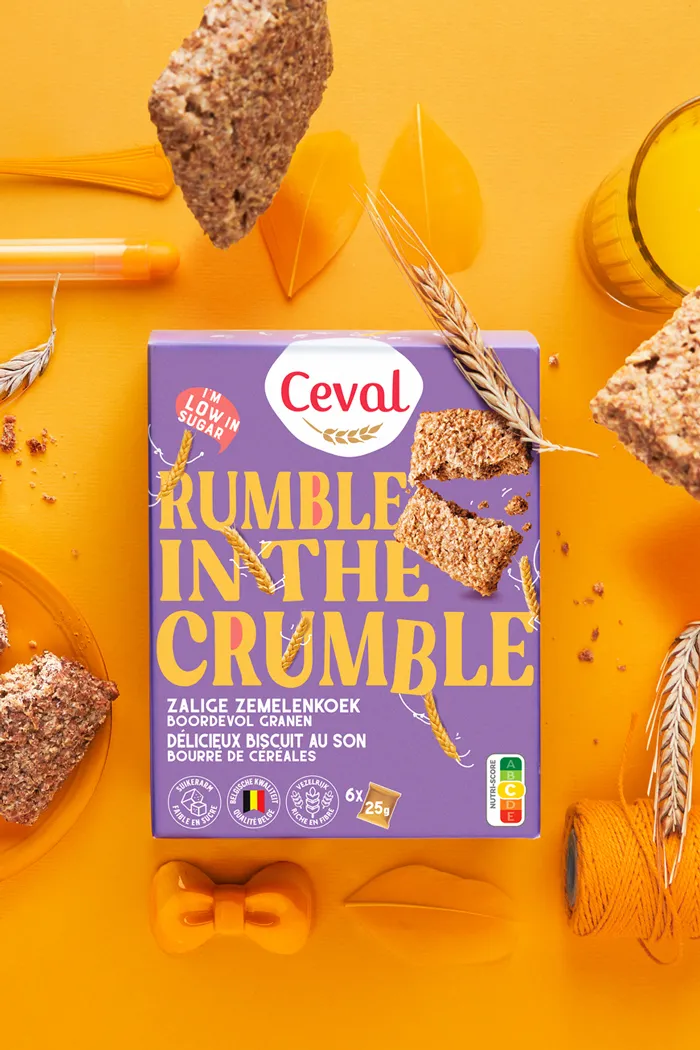
Packaging design by Catchafish

Giving back the pride to the brand.

The challenge

For more than 40 years, Ceval has put all their passion and expertise into a natural and healthy diet cookie. But in a world full of empty ‘better for you’ promises, the big established diet brands conquered the shelves. Raising their health benefits to the top. And pushing Ceval into a gloomy corner where it slowly lost all its value. A repositioning of the brand was urgently needed.

The result in positive change

The new positioning of Ceval gave the brand back its pride and a clear brand story which could be communicated easily. The dynamic designs even had an impact on the company itself, giving everyone a energetic boost for a bright future.

— Client

Ceval / La Confiance

— Market

Retail + Bio Channel

— Expertise

Brand strategy + repositioning Brand logo update Brand identity Packaging design

Result

redesign for Ceval
A quote on a purple backdrop about biscuits
Redesigned Packaging for Ceval

Strategy

We convinced Ceval to turn negative into positive by taking advantage of the current trends where health is becoming more and more the standard. No more diets. No more finger-pointing questions like ‘so tell me, what’s your problem?’. As their healthy cookies already were blessed with a good taste, we could make a swift move from a rational health product to an energizing feel good lifestyle brand.

Redesigned Packaging for Ceval. Purple biscuit box on a yellow table with yellow tablewear
Packaging redesign for Ceval biscuits called golden oldie.
“The strategic work was a perfect start that lead us to the creative designs, perfectly fitting our brand. With their enthusiasm, Catchafish made us believe in our brand again.”

CINDY MERTENS - HR manager Ceval / La Confiance

Detail of the redesigned packaging for Ceval by Catchafish

The redesign

Of course, there is a big gap between the pleasure of indulgence and the ratio of a healthy diet. For Ceval, we build a big bridge for that big gap, combining the best of both worlds. In that way, we vitalized the brand by giving back its pride.We redesigned the brand logo and the packaging into a colourful spectacle where big quotes shout out with joy, being the playground for funny little stories. All of them celebrating life and the goodness of nature.

Three candy boxes in different colors, packaging design for Ceval
Ceval packaging design, candy

THE FUTURE

2023 has successfully started with the introduction of these 3 cookies. Soon the waffles will follow in the new designs.

rebranding for Ceval by Catchafish

Explore more similar work →

Interested in how
we can make your brand STAND OUT?

Why not catch up?
We’d love to get to know you better.

Get in touch →